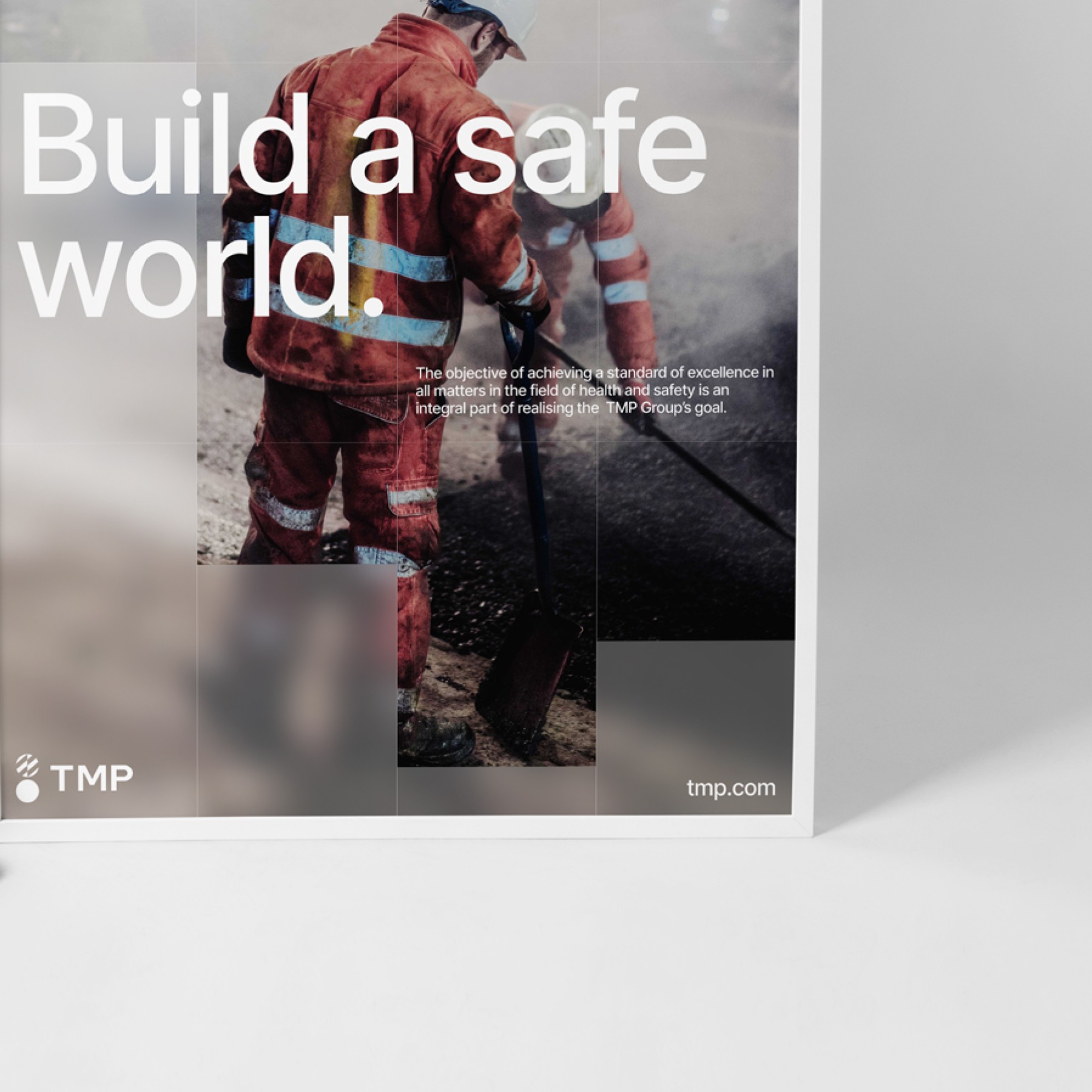
Communication strategy

Good communication builds market understanding of our brand, gains recognition and trust, and makes us meaningful to customers, partners and employees. It must be clear and consistent.

Downloads files

Concept

We try to clearly and clearly express the essence of our brand: who we are, why we are here, how we differ and how we want to be perceived. Our concept of communication becomes the basis of our communication, helping us to be consistent in all aspects of our activities.

Our brand platform is closely tied to our values and promise to the world. Before defining our tone, it is important to go back to the fundamentals on which our brand is built.

We are building a safe world where everyone can see potential, positivity and progress. Instead of looking at the worst, we open our eyes to all that is good in order to create a better future for all. Because we see what really matters - we see the people we build for and we build a better life for them

TMP - "Build a safe world".

Build a safe world

"Build a safe world" is more than a slogan. This is a rich, evolving story about the power of perception. Our story is about how a trained eye sees things differently - and recognizes what others miss. We strive to make an extra effort: to see the positive, not just the threats. Potential in everyday life. And believe in progress, always look ahead, aim for something better. And never lose sight of what matters most to others.

Recommendations

We have developed a communication concept that easily translates into clear and confident layouts by following certain visual guidelines.

Logo placement

The logo is best placed in the bottom or top left corner.
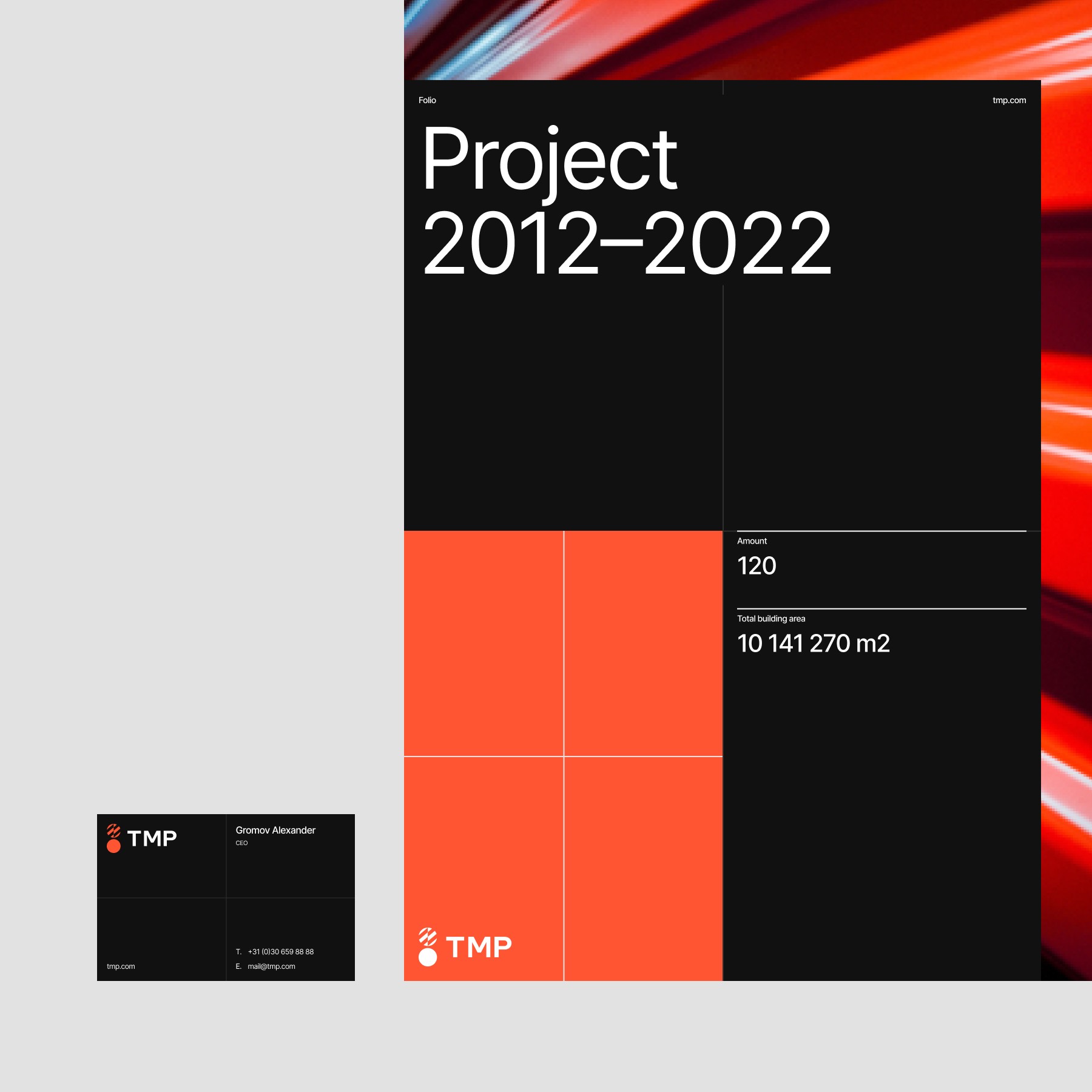
Use of the logo on backgrounds

Use the monochrome version of the logo on color and photo backgrounds
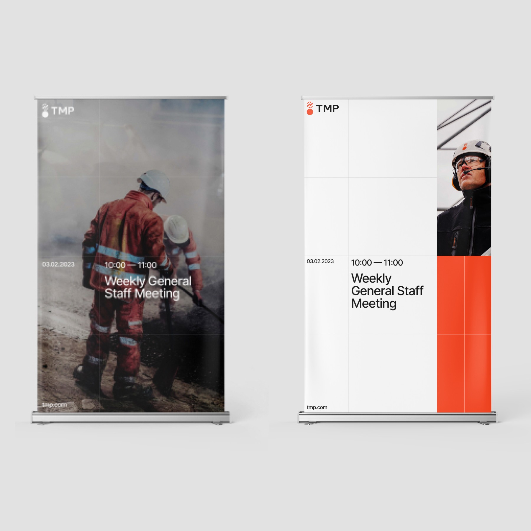
Typography

Only two font sizes can be used, large and small, to create contrast in typography.
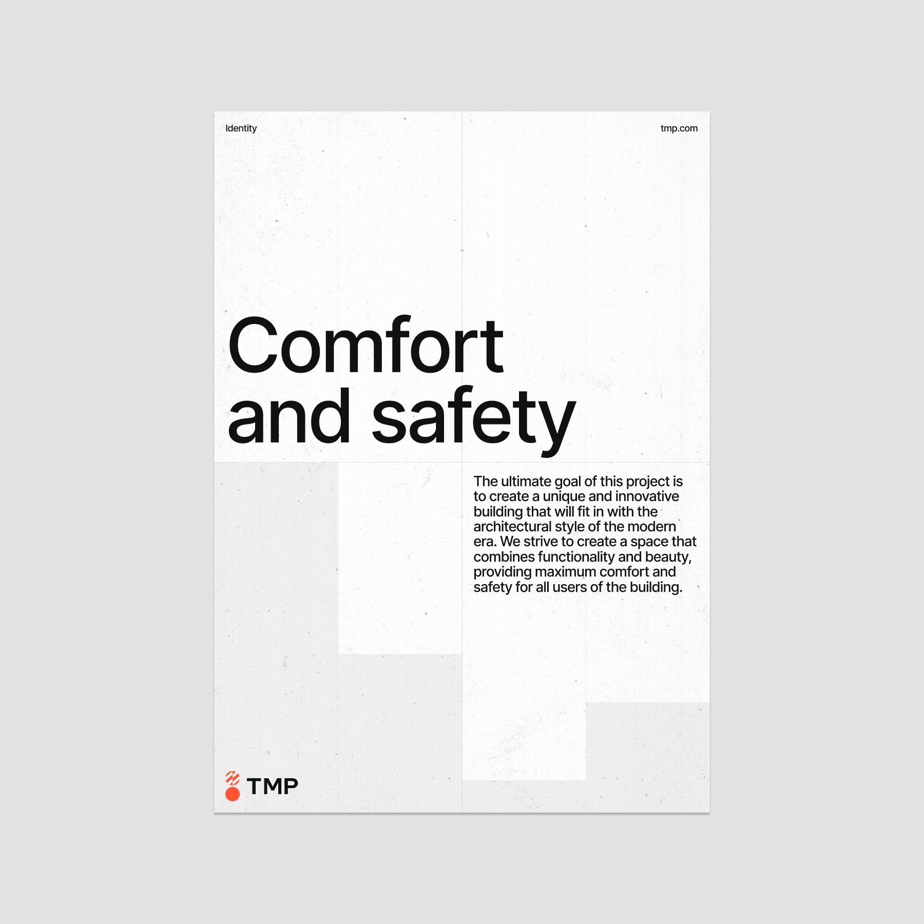
Slogan placement

The slogan can be placed in the logo descriptor or separately.

Alignment

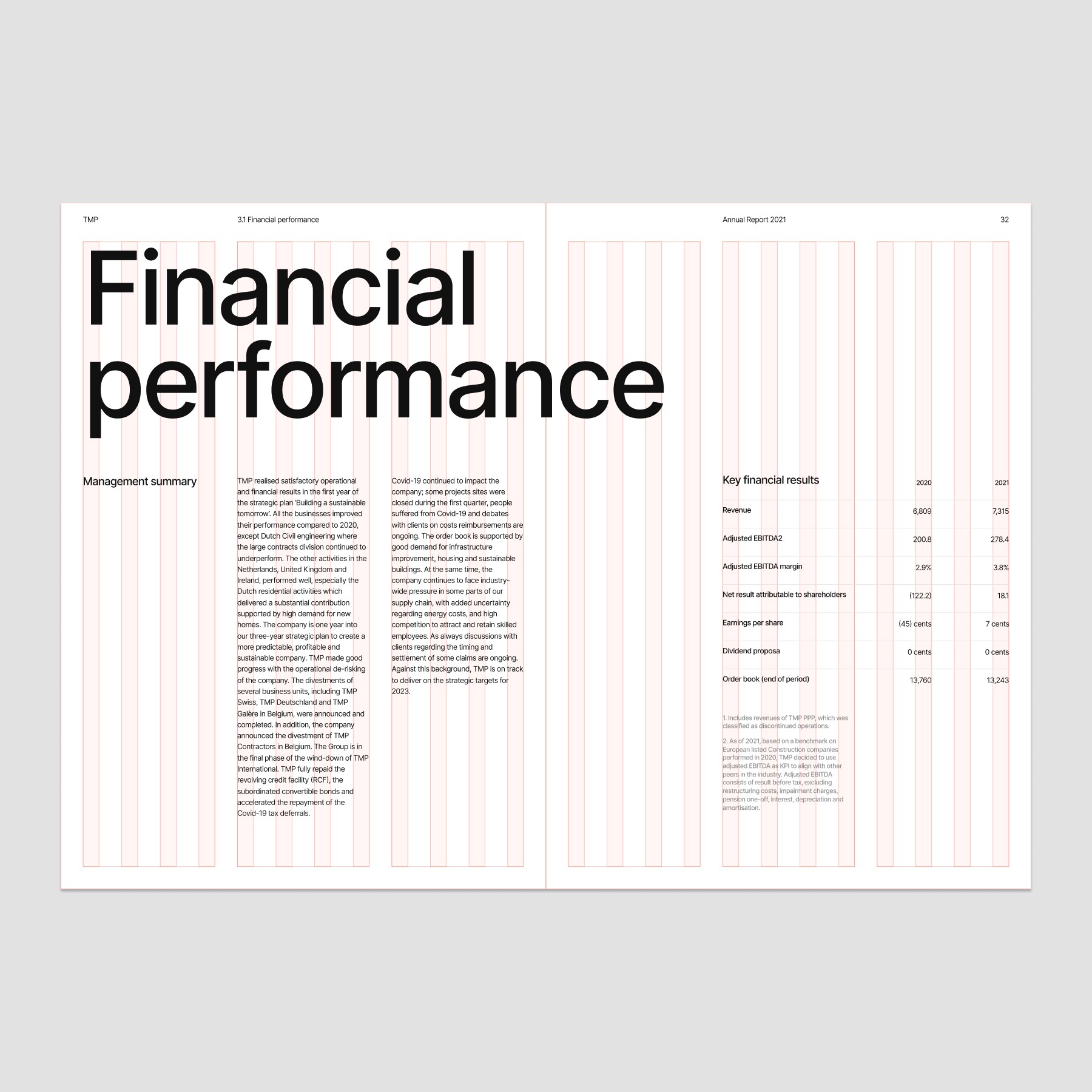
All elements must be aligned to the grid.
Link to site

Use the website URL for printed materials only. Don't use it in a digital context.