Typography
Typography is an important component of a visual identity. The identity places great emphasis on contemporary typographic expression, but also ensures that clarity of communication is not compromised as a result. Inter and its processing provide visual consistency across all our communications and help us build visibility and strengthen our brand.
Downloads files
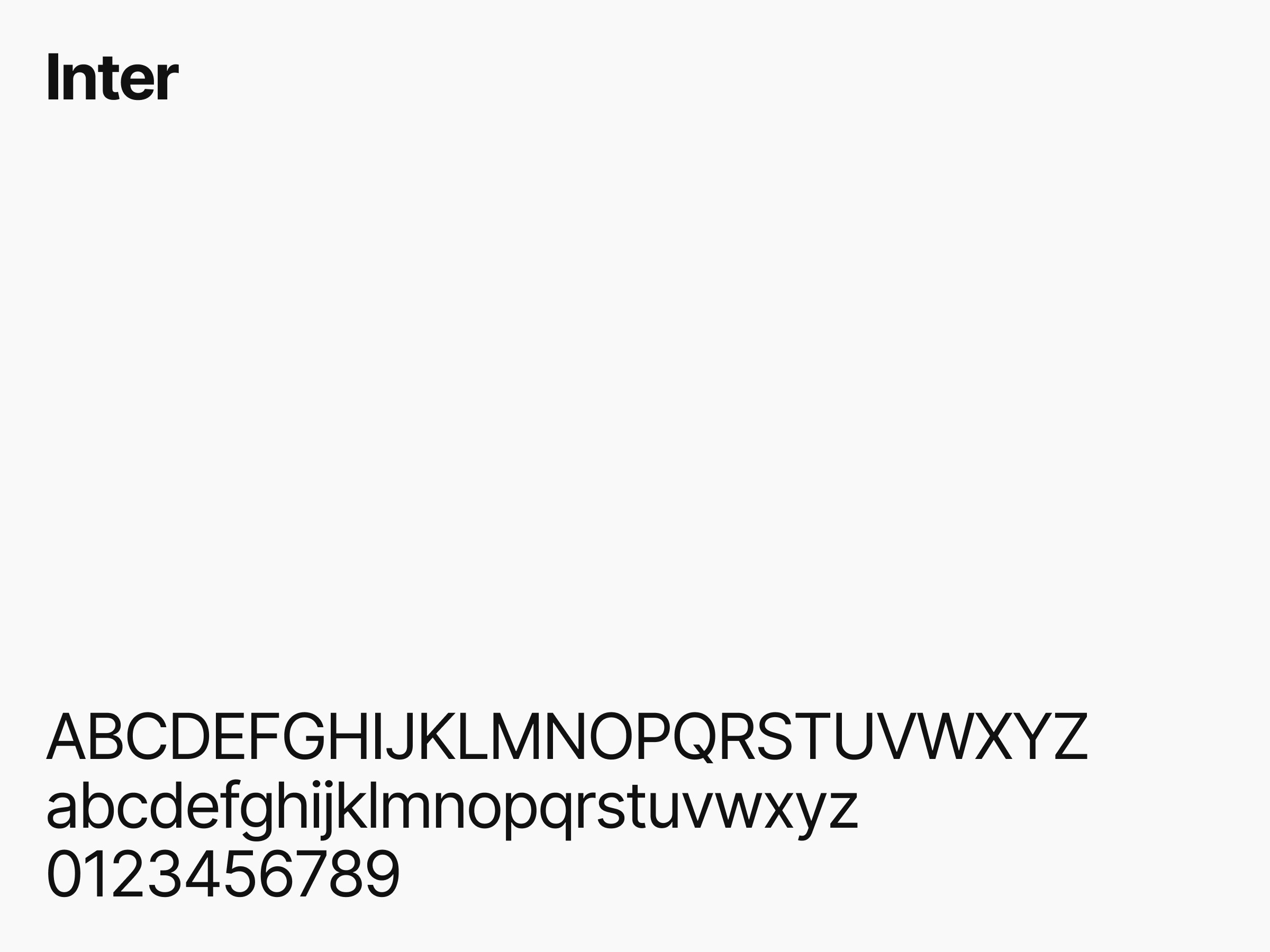
Сorporate font
Inter is a typeface that is completely inspired by the brand. Its design carefully balances expressiveness and functionality. The font is timeless, crafted with meticulous attention to detail, and functional for a variety of uses and touchpoints. But beyond that, it's accessible and distinctive, making it ideal for more expressive applications.
The letterforms take inspiration from the symbol, paying homage to the three points through the application of geometric curves. The modern yet thoughtful design ensures that no matter the task at hand, we have a unified and appropriate voice to speak with.
Font styles
Inter is available in three weights: Bold, Medium and Regular. Each of the three weights has its own functionality and use, meaning that headings, body text, and supporting typographic details are taken into account. With these available options, it's easy to communicate clearly in all types of applications, from large messages to smaller, more informative texts. The obvious contrast between the weights ensures a clear definition between them and means that it is easy to achieve typographic hierarchy when needed.
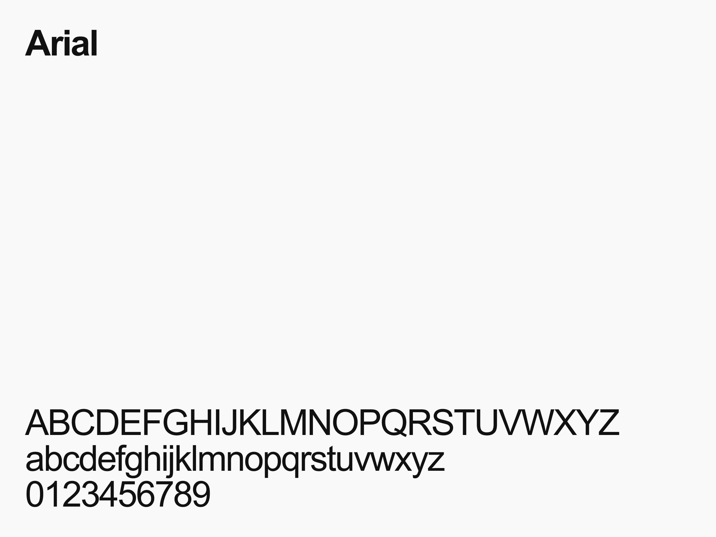
System Font
Since Inter is a strong brand carrier, it should be adopted throughout our organization whenever possible. However, when a system font is needed that does not require a special license and is available on all computers, we choose Arial as a fallback.